Visualizing SkyServer Weblog with Vista
DISL
at Georgia Tech and Jim Gray at Microsoft
This project was initiated during Jim Gray’s visit on April
15, 2002 as College of Computing Distinguished Lecturer. The SkyServer log was
provided by Jim Gray.
Sample Data from SkyServer Weblog
The SkyServer traffic log is
partially available at http://skyserver.sdss.org/en/tools/traffic.asp
and we get 1000 log entries from the skyserver click stream log using the
following SQL statement:
select top 10 * from weblog..weblog
At http://skyserver.sdss.org/en/tools/search/sql.asp
From the schema of the
Weblog, we select the following four fields as the most significant columns for
understanding these 1000 log records. With larger set of log data, one can
choose all the fields or different set of fields if necessary.
|
Sequence Number |
ClientIP |
Command |
Error Code |
Sequence Number: represents the time of command arrival. The larger
the sequence number, the earlier the arrival time.
ClientIP: IP of the client who sends the command
Command: all commands are “GET” commands, so we only process
the required URL.
Error Code: defined in HTTP, for each command.
“200” :Success
"302":Moved Temporarily
"304":Not Modified
"404":Not Found
"500":Internal Server Error
Total
Click Stream Log Records : 1000
Here is the sample data we
used: Download
the dataset
Visualization using VISTA
Vista reads the sample data
and performs a series of transformations:
- Using a hash function, transform non-numeric
data (e.g., strings) into numeric data.
- Map the k-dimensional numeric dataset (k=4 in
this case) into a 2-dimensional dataset for display. The k dimensions are
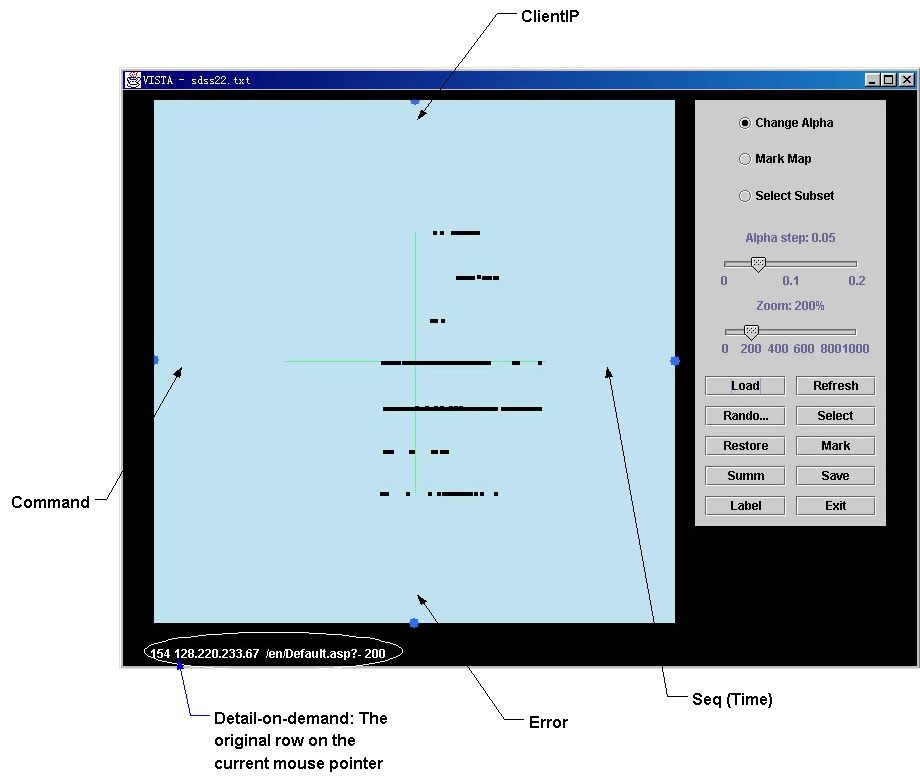
represented by the k axes. For this picture, the 4-dimensional star happens to look
like an orthogonal system , but the “X-axis” really contains two dimensions (Command and
Seq(time)) and the “Y-axis” corresponds to two other dimensions (ClientIP
and Error).
- The user interacts with the visualization below to analyze the features. (For more features of VISTA user interface, please refer to the reference).
Figure
1. Initial visualization
Figure 1 is the initial
visualization. The 4 dimensions are marked by “ClientIP”, “Command”, “Error”
and “Seq(time)”. In the initial
visualization, it is not easy to find useful patterns. The first mode of interaction is to
adjust the weight of each dimension by clicking on the blue widget at the end
of the axis. This is called
alpha-adjustment a
value” in the above screen.
Additional operations include zooming, random rendering, subset
selecting and marking. Also, the
raw data of current mouse-pointed item is automatically displayed at the bottom
of the window.
Step 1: clustering the "Commands" of each client
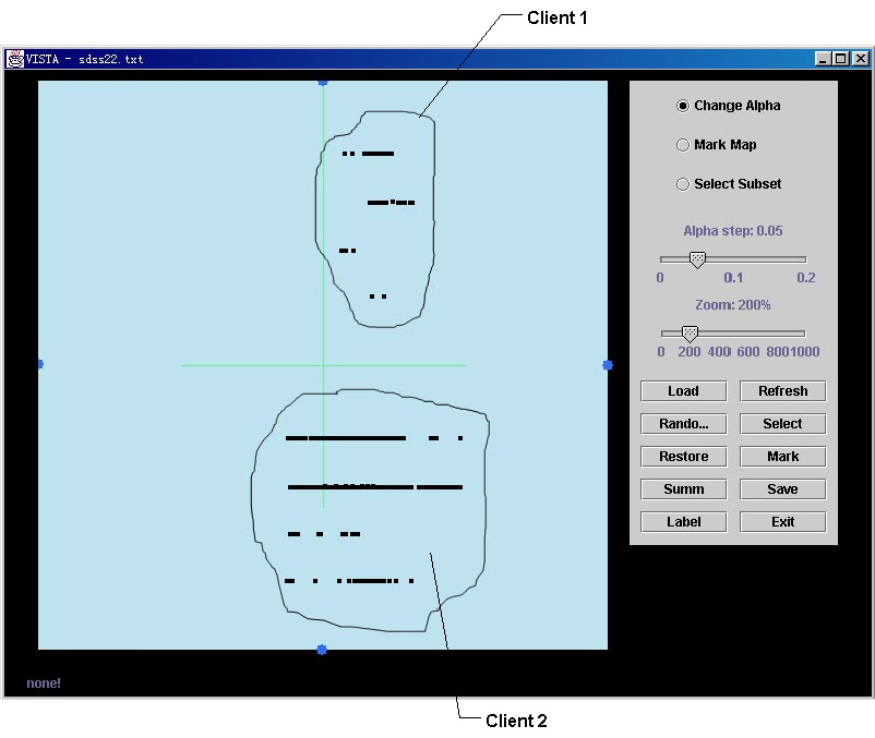
Figure 2. Find the distinct clients in the dataset
First, we try to find the
number of clients in the dataset by clicking the blue widget labeled with “ClientIP”.
By increasing the weight of this dimension, we can see two clusters of points
forming, as seen in Figure 2. This
means there are 2 distinct IP addresses in this dataset. And also we can see
that client 2 issues more commands than client 1 because there are more points
in the cluster of client2. The number of commands in each cluster can be
observed by clicking the “summary” button on the screen. The client IP of each
cluster is seen immediately by positioning the mouse pointer on any point in
the cluster. This is a simple illustration of visualizing clusters in one
subspace. To find clusters in terms of
other dimensions, we need to set the a of “non-interesting” dimensions to 0, and then
change the a
of the dimensions of interest.
This is illustrated in the next step.
Step 2: Analyzing error codes
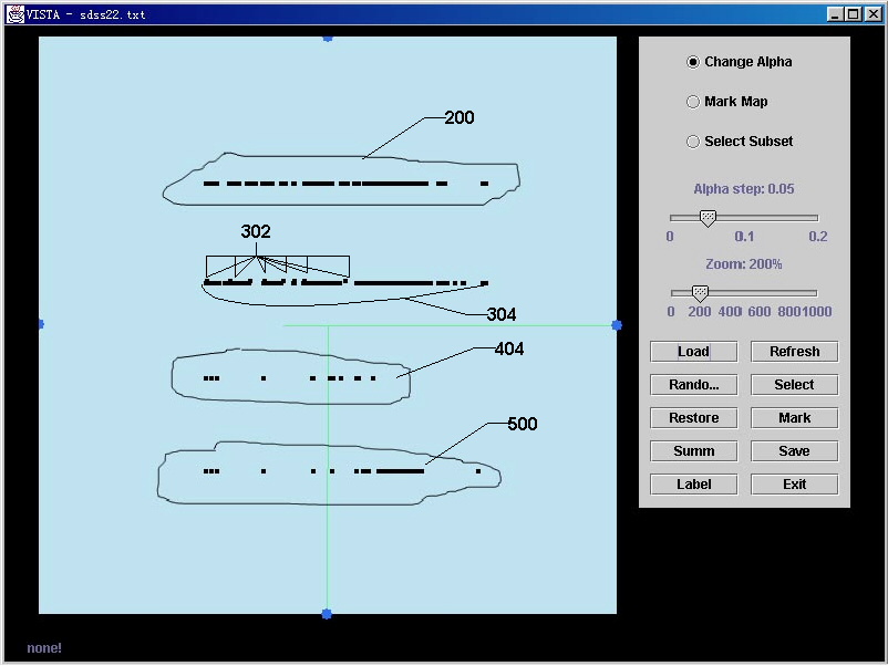
Figure 3. Observing the distribution of error code
To emphasize the clustering
results of other dimensions, we visually merge the data from the two
clients by setting the a
of “ClientIP” to 0. In Figure 3 we see 5 groups along the Error axis. (Note the disappearance of the green
line that represents the ClientIP dimension. This can be imagined as “looking at the points along the
ClientIP axis”.) There are four
obvious horizontal lines plus the subtle distinction between “302” and “304”
shown by a slight vertical difference.
The Error code of each group is shown on the bottom line by positioning
the mouse on any point of the group.
The number of points on each
horizontal line shows the number of each Error (more 200’s than 30X, and some
“404” errors). The Error codes
from the two clients may be separated by resetting the a of “ClientIP” to a positive value.
Step 3: Analyzing command & error codes
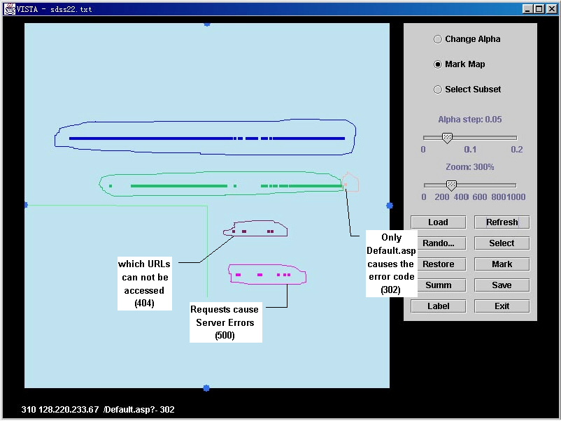
Figure 4. Analyzing the relation of error code & command
To display the relationship
between different kinds of Commands and Error codes, we set the a of “ClientIP” and “Seq(time)” to 0 and set the value
of a for “Command” to
maximum. This merges the two clients and also eliminates the time difference,
and stretches the Command axis at the same time. It groups all the same commands (over different
times), facilitating a detailed analysis of commands that cause certain Error code. For example, at the right end of the
green cluster we have a point corresponding to Error “302”. It means that only one command causes
the Error “302”, which is “/default.asp?-“. By positioning the mouse pointers on other groups, user can
see the commands that cause other errors, e.g., purple for “404” and pink for
“500” that are serious errors for web pages. Typically, “404” indicates a web
page with out of date URLs that are no longer valid. Similarly, “500” shows server error that requires debugging.
Step 4: Analyzing time sequences
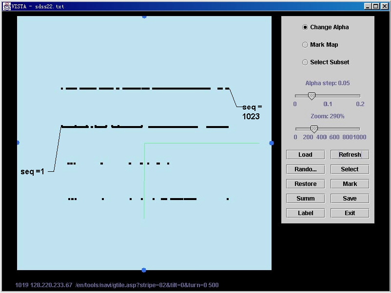
Figure 4. Time sequence of different dimensions
The relationship
for any two dimensions can be easily repeated. Setting a of “Command” and “ClientIP” to 0, we can analyze the
time sequence for each Error code.
Although we have found interesting results from the first three steps, we
didn’t see obvious relationships from the visualization in this step.
User can also move
“ClientIP” or “Command” dimension to the position of “seq” (by setting the a of seq to 0), we can observe the time
relationship between different clients or different commands. Additional features are described in
the papers below.
.
Reference:
[1] Keke Chen, Ling Liu:
“Cluster rendering of skewed datasets via visualization
”, ACM SAC 2003
[2] Keke Chen, Ling Liu:
“ VISTA: validating and refining clusters via visualization, J. of Information Visualization, Sept. 2004”